Data Projects > Data Visualization
Programming Visualizations in C#
Here's a collection of interactive data exploration and visualization programs I created for a graduate course in Data Visualization that I took at Worcester Polytechnic Institute (WPI) Fall, 2008. I programmed these projects in C# using Microsoft Visual Studio .NET (2003) and the GDI+ graphics API.
Parallel Coordinates
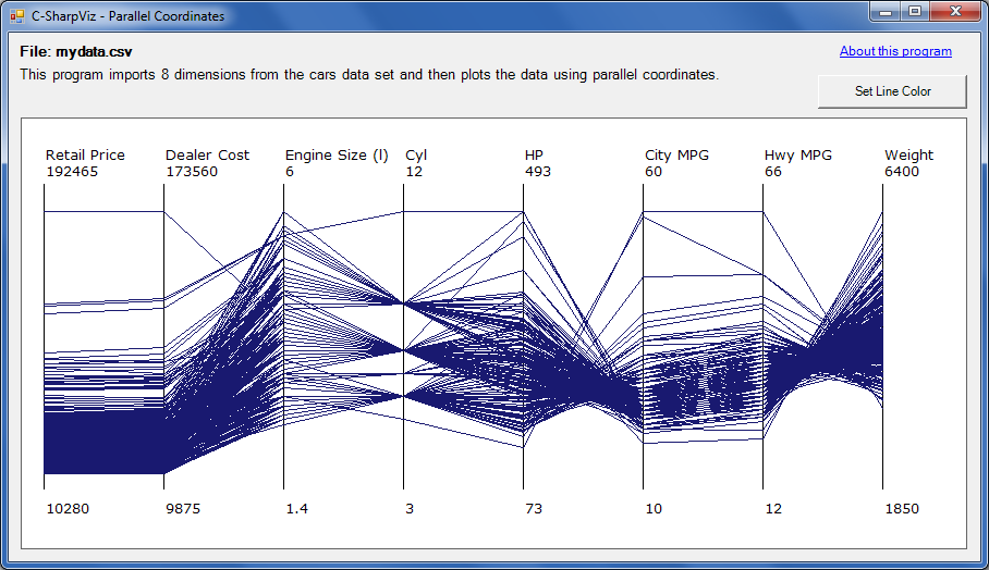
Parallel coordinates (https://en.wikipedia.org/wiki/Parallel_coordinates) show multiple dimensions as separate columns across a common x axis. Each line represents one record from the data set and allows you to quickly see distribution, clustering and grouping among the data values and records.
This example plots 8 dimensions from a car data set including pricing, engine size, weight and MPG.
View project on GitHub
This example plots 8 dimensions from a car data set including pricing, engine size, weight and MPG.
View project on GitHub
Color Bar
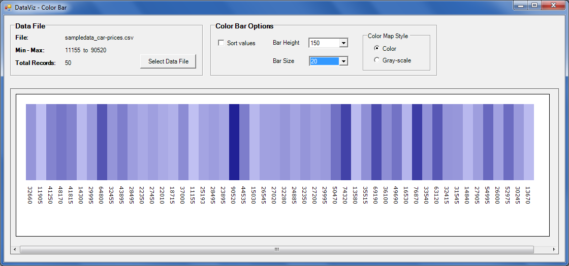
GOAL: Use color intensity as a visual indicator to show the range of values for a data set of car prices. Import the data from a car database and determine the minimum and maximum price values. Programmatically assign a color intensity for each car based on its price. Lighter colors are lower values and deeper colors are higher values.
RESULT: The lightest intensity of color is for the car with the lowest price of $11,155 and the darkest intensity of color is for the car with the highest price of $90,5020. All the other prices are assigned a color intensity somewhere along that min-max spectrum.
View project on GitHub
RESULT: The lightest intensity of color is for the car with the lowest price of $11,155 and the darkest intensity of color is for the car with the highest price of $90,5020. All the other prices are assigned a color intensity somewhere along that min-max spectrum.
View project on GitHub
Scatter Plot with Multiple Dimensions
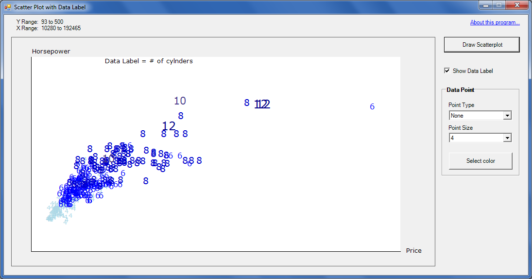
GOAL: Program a scatter plot that shows three dimensions of a car data set - horsepower, price, and number of cylinders.
RESULT: You can quickly see how price and horsepower are impacted by the number of cylinders in a car's engine. For the most part, the more cylinders in the engine, the higher the performance and cost of the car. Price and horsepower are shown with increasing value along the x and y axis respectively. The number of cylinders in each car's engine is shown as an actual numeric value at the intersection of price and horsepower. Color and font size of each data point vary to highlight the number of cylinders (from 4 to 12) for each car.
View project on GitHub
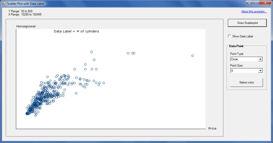
Displaying data values as points
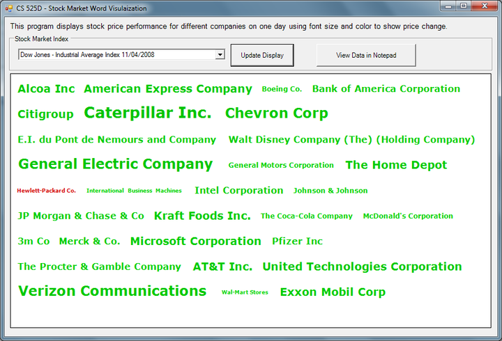
Stock Market Word Cloud Visualization (Data Cloud)
Word clouds are typically used to visualize word frequency in unstructured text data. In this example, I applied the concept of a word cloud as a 'data cloud' to show stock market performance. The color and size of the text is based on the underlying data values from the one-day stock performance of companies in some different stock indexes.
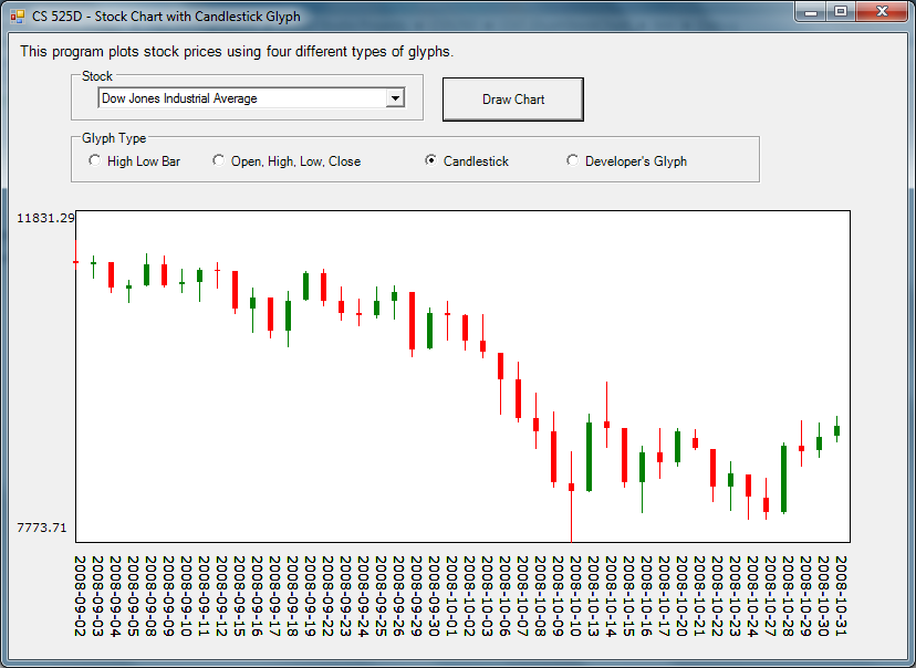
Stock Chart and Glyphs
Examples of different glyphs (symbols) to show daily stock price performance by open, close, min and max price values.
Scatter Plot with different visual cues for a selected data point
These examples show different visual indicators to show a specific target data point.
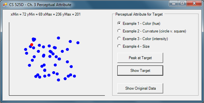
Target by color
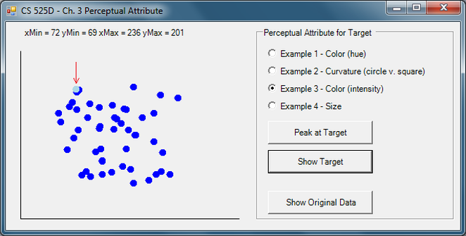
Target by color intensity
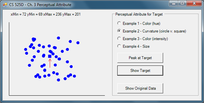
Target by shape
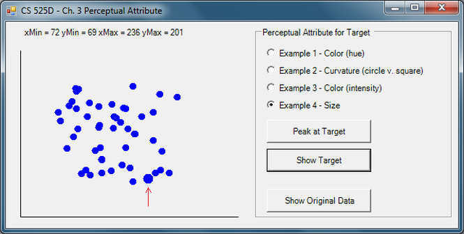
Target by size
