Data Projects > Stock Market Visual Explorer
Here's a collection of interactive data exploration and visualization programs I created for a graduate course in Data Visualization that I took at Worcester Polytechnic Institute (WPI) Fall, 2008. I programmed these projects in C# using Microsoft Visual Studio .NET (2003) and the GDI+ graphics API.
Stock Market Visual Explorer
GOAL: Use one or more data sets and other pieces of information to create an interactive data exploration and visualization project.
RESULT: Stock Market Visual Explorer is an interactive data visualization Windows-based program that shows the decline of the stock market during 2007 to 2008. The application displays the Dow Jones Industrial average and ties the data together with Federal Reserve speeches that were given during that time period.
You can click on a speech and display an image of a word cloud for the selected speech. The word clouds are screenshots of the visualizations that I created using the IBM Many Eyes and Wordle.net web sites. You can also choose different glyphs to draw the stock market trace and can also change time period between daily, weekly, monthly.
The visualization also shows the min and max values of the Dow Jones Industrial average. You can also display news events that show the different companies that had financial struggles or went bankrupt over the time period.
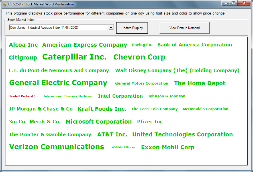
Stock Market Word Visualization (Data Cloud)
This data cloud shows stock performance by color and size of text.
Stock Chart and Glyphs
Examples of different glyphs (symbols) to show daily stock price performance by open, close, min and max price values.
Color Bar
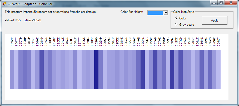
GOAL: Use color intensity as a visual indicator to show the range of values for a data set of car prices. Import the data from a car database and determine the minimum and maximum price values. Programmatically assign a color intensity for each car based on its price. Lighter colors are lower values and deeper colors are higher values.
RESULT: The lightest intensity of color is for the car with the lowest price of $11,155 and the darkest intensity of color is for the car with the highest price of $90,5020. All the other prices are assigned a color intensity somewhere along that min-max spectrum.
RESULT: The lightest intensity of color is for the car with the lowest price of $11,155 and the darkest intensity of color is for the car with the highest price of $90,5020. All the other prices are assigned a color intensity somewhere along that min-max spectrum.
Scatter Plot with Multiple Dimensions
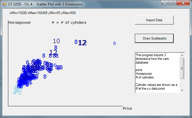
GOAL: Program a scatter plot that shows three dimensions of a car data set - horsepower, price, and number of cylinders.
RESULT: You can quickly see how price and horsepower are impacted by the number of cylinders in a car's engine. For the most part, the more cylinders in the engine, the higher the performance and cost of the car. Price and horsepower are shown with increasing value along the x and y axis respectively. The number of cylinders in each car's engine is shown as an actual numeric value at the intersection of price and horsepower. Color and font size of each data point vary to highlight the number of cylinders (from 4 to 12) for each car.
RESULT: You can quickly see how price and horsepower are impacted by the number of cylinders in a car's engine. For the most part, the more cylinders in the engine, the higher the performance and cost of the car. Price and horsepower are shown with increasing value along the x and y axis respectively. The number of cylinders in each car's engine is shown as an actual numeric value at the intersection of price and horsepower. Color and font size of each data point vary to highlight the number of cylinders (from 4 to 12) for each car.


